Squad Website Redesign: A UI/UX Case Study
Jan 12, 2022
Project Overview
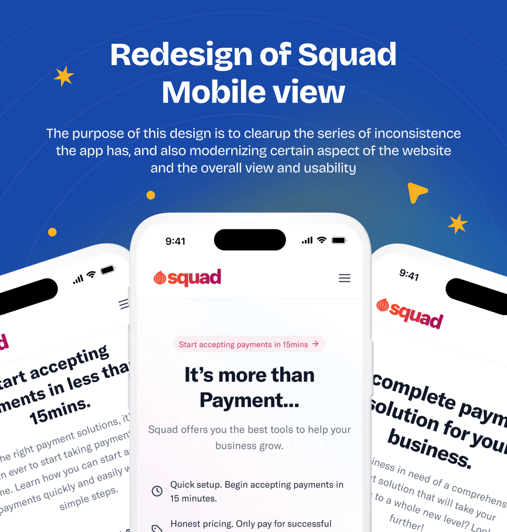
Squad provides a customizable payment system in Nigeria, enabling users to start accepting funds within 15 minutes of installation. This project involves redesigning the mobile view of Squad’s website to enhance visual appeal, usability, and user retention.
Design Role and Project Duration
Designer: Victor Onyemuwa
Roles: Researcher, Wireframe Designer, User Flow Creator, Persona Developer, UX Designer, UI Designer
Timeline:
Research: 2 days
Sketch and Wireframe: 1 day
High-fidelity Design: 2 days
UI Testing: 2 days
Total Duration: 7 days
Problem Statement
The current website has several recurring issues:
Outdated design compared to competitors.
Inconsistent user experience.
Disjointed alignment across sections.
The overall design needs an overhaul to remain competitive.
Proposed Solution
A comprehensive redesign was undertaken to improve aesthetics and usability, incorporating a cohesive design system affecting all key interactions on the site.
Redesign Details
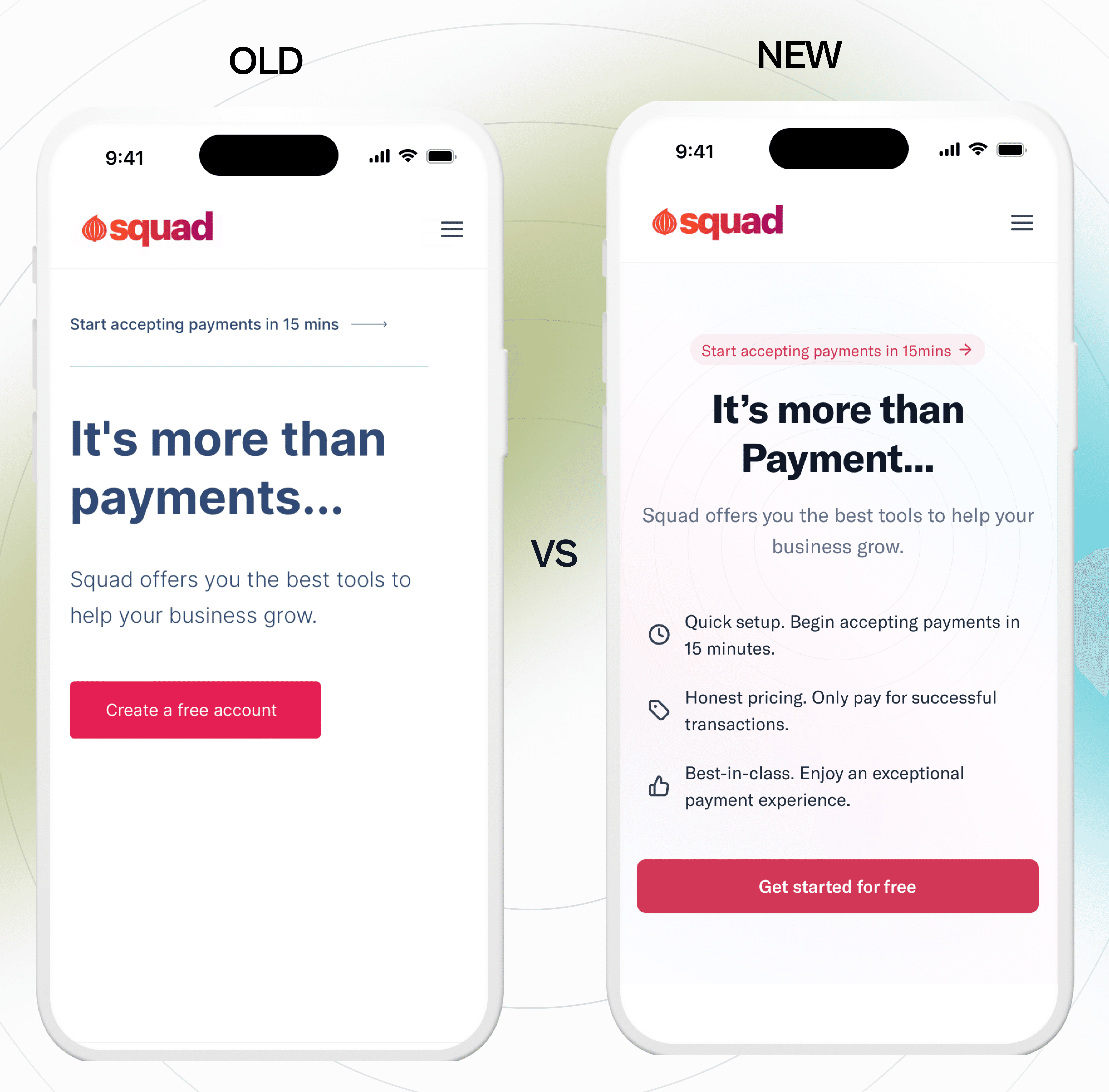
Hero Section
Old Design: Misaligned header and banner, poorly placed call-to-action button.
New Design:
Centralized header and supporting text.
Enhanced call-to-action button filling the section width.
Gradient background for visual contrast.
Key message "Start accepting payments in 15 minutes" highlighted in a prominent tag/container.
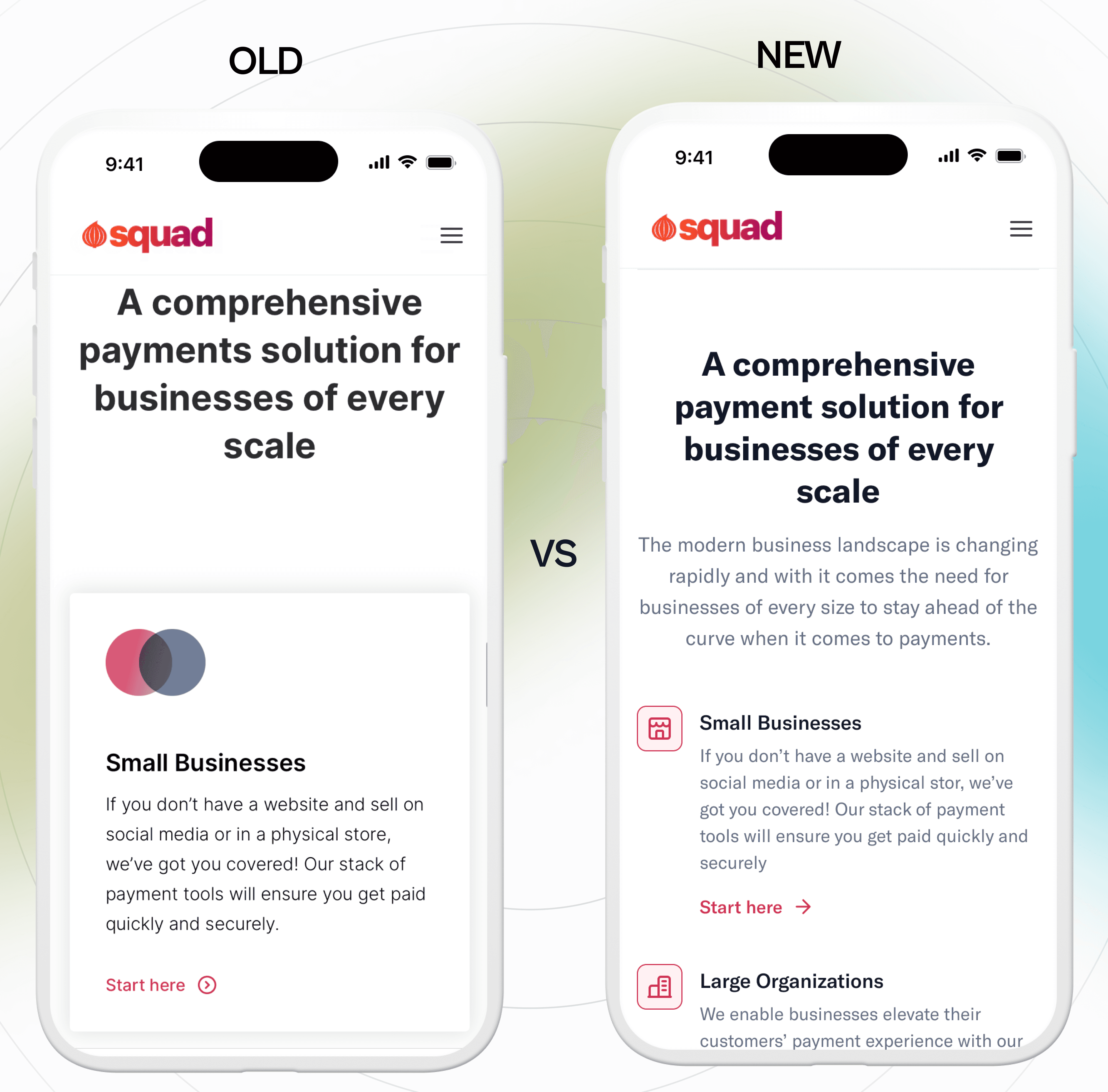
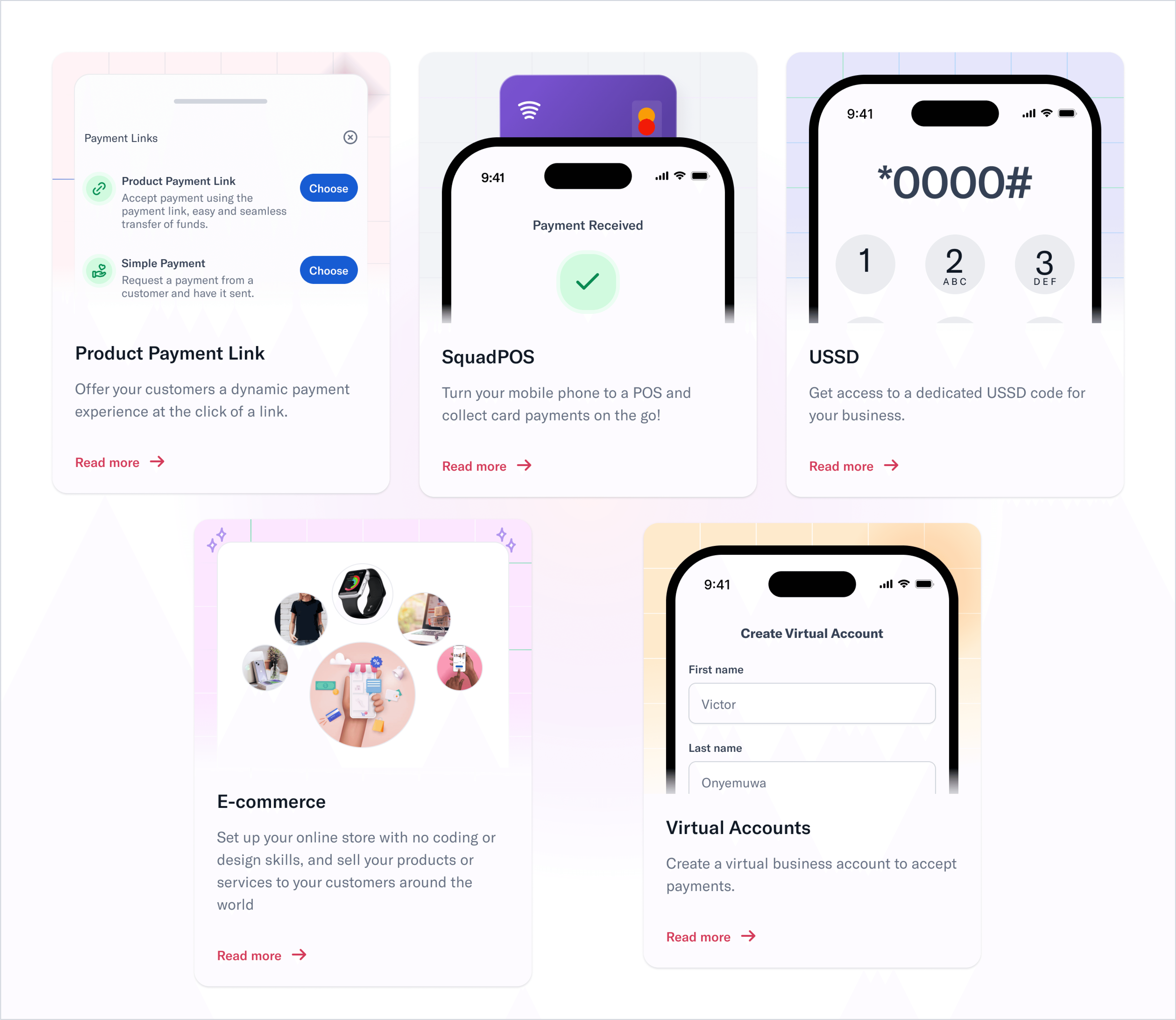
Feature Section
Old Design: Poor alignment, bland, and uninviting information cards.
New Design:
Modern, user-friendly layout with descriptive supporting text.
Updated cards with visual descriptions and added call-to-action buttons.
Implementation of text and color hierarchy.
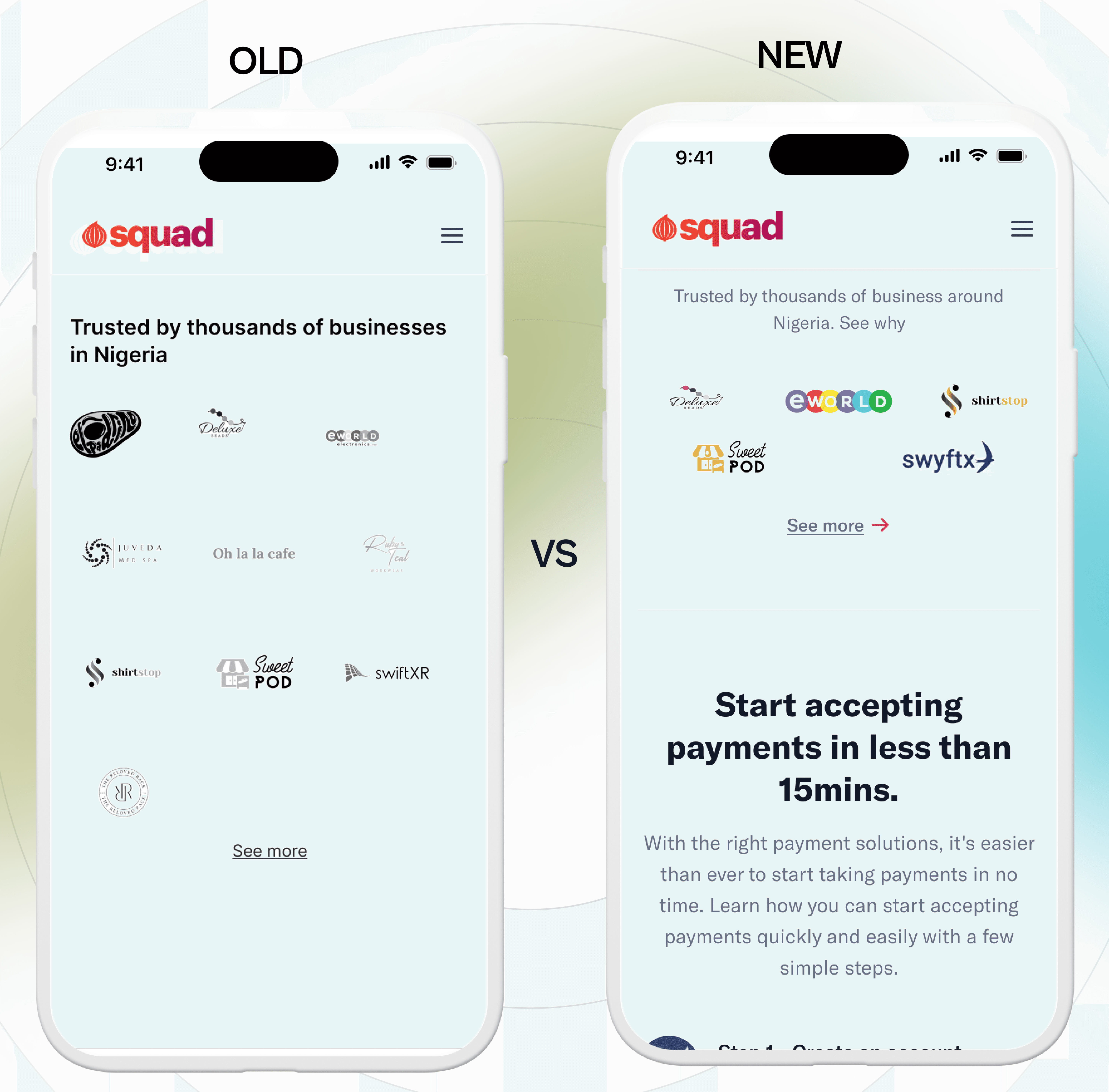
Brand Section
Old Design: Cluttered with misaligned images and varying text sizes.
New Design:
Streamlined by reducing the number of brands to five.
Improved alignment and image placement for a cleaner look.
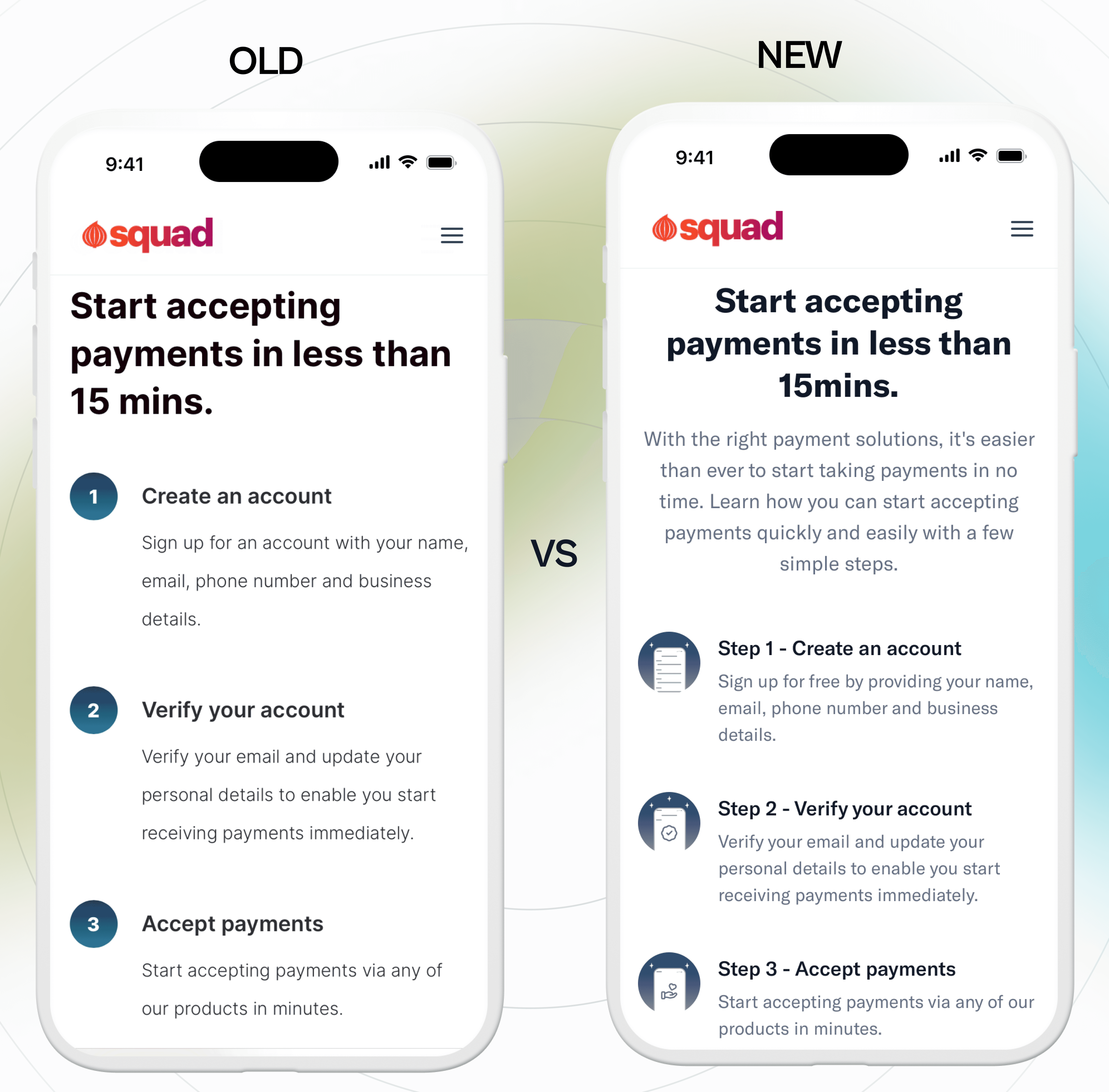
How-to-do Section
Old Design: Misalignment and unclear guidance.
New Design:
Clearer icons replaced with imagery descriptions.
Supporting text added for better user understanding.
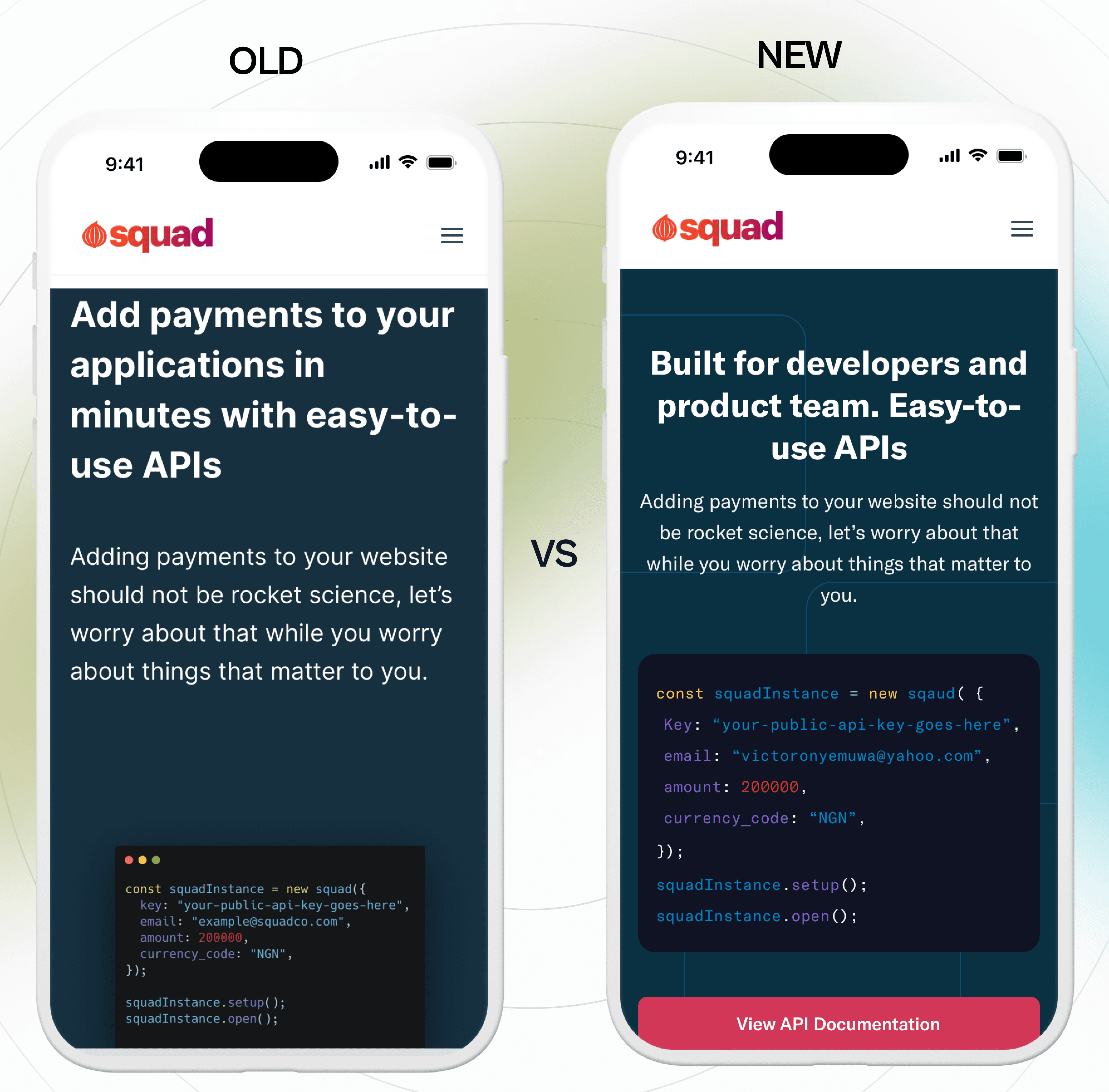
API Section
Old Design: Left-aligned and inconsistent with other sections.
New Design:
Centralized alignment for consistency.
Reworded header and expanded call-to-action button.
Updated code image to match the new style.
Features Section
Old Design: Overly complex with oversized text.
New Design:
Simplified layout with appropriate icons.
Reduced text size for a more modern look.
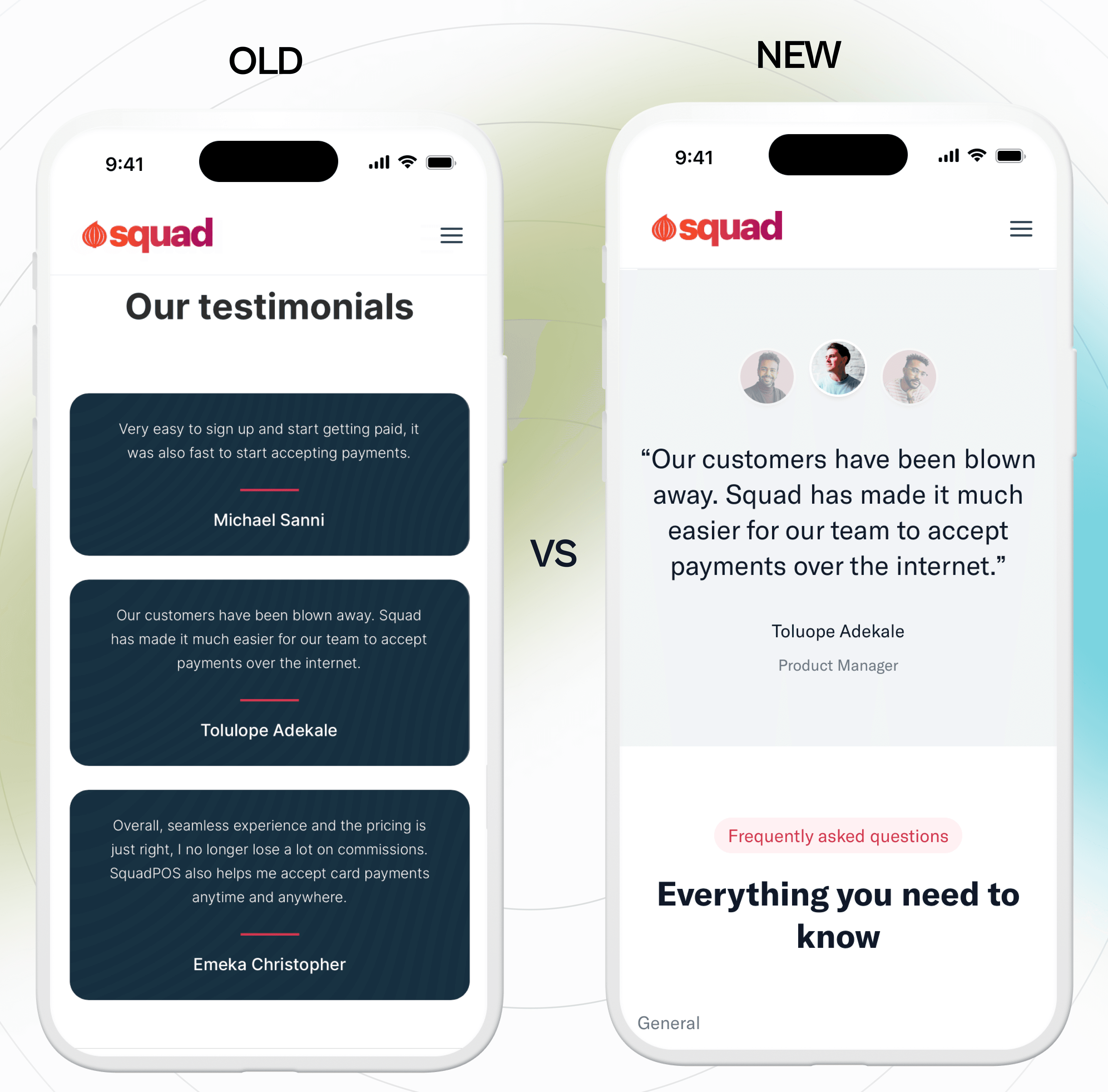
Testimonials
Old Design: Difficult to read and lacked detailed information.
New Design:
More professional look with added individual positions, companies, and roles.
Modernized design for easier readability.
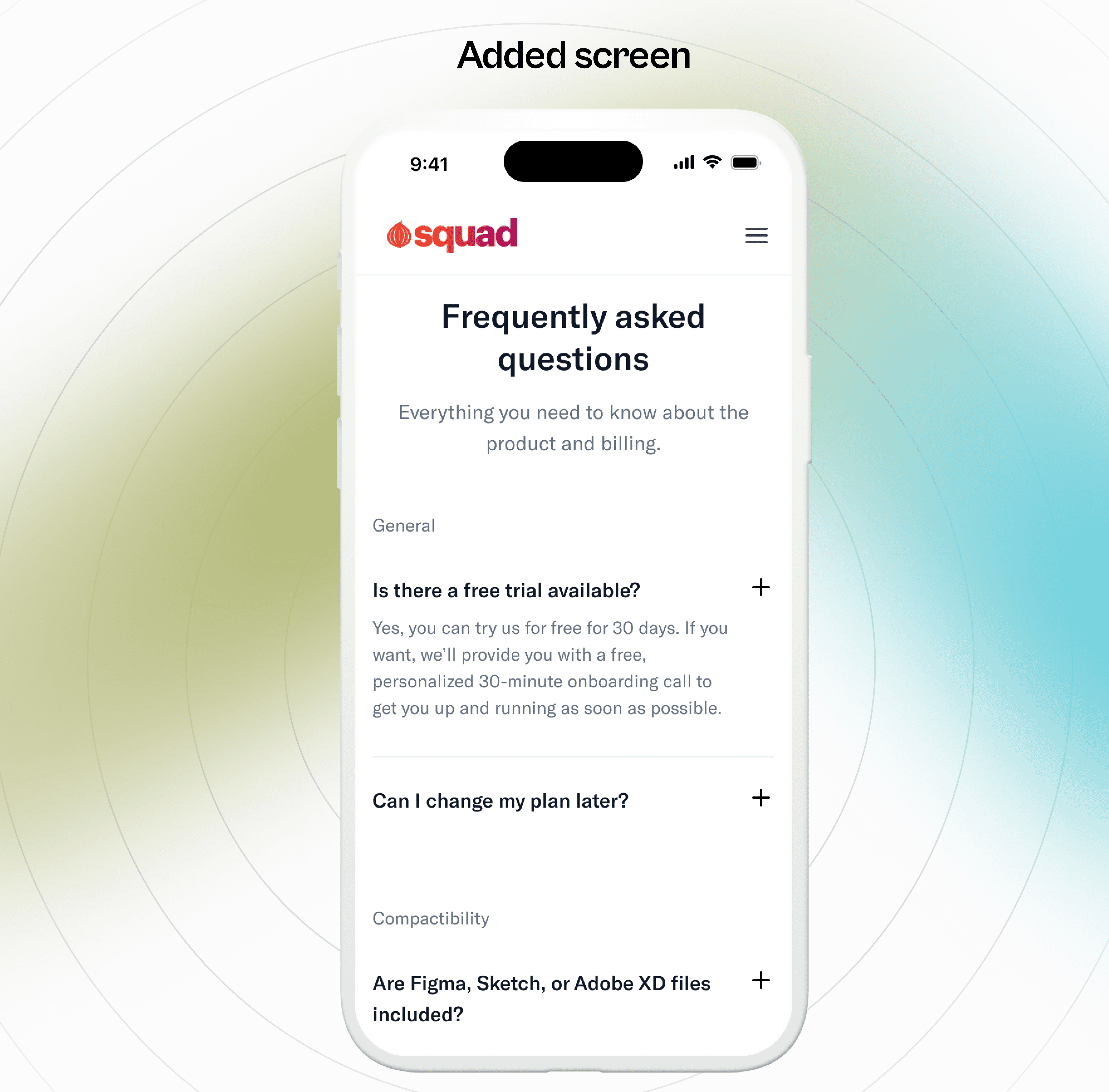
Frequently Asked Questions
Addition: This section was added to address common user queries, reducing the need for support requests and enhancing user satisfaction.
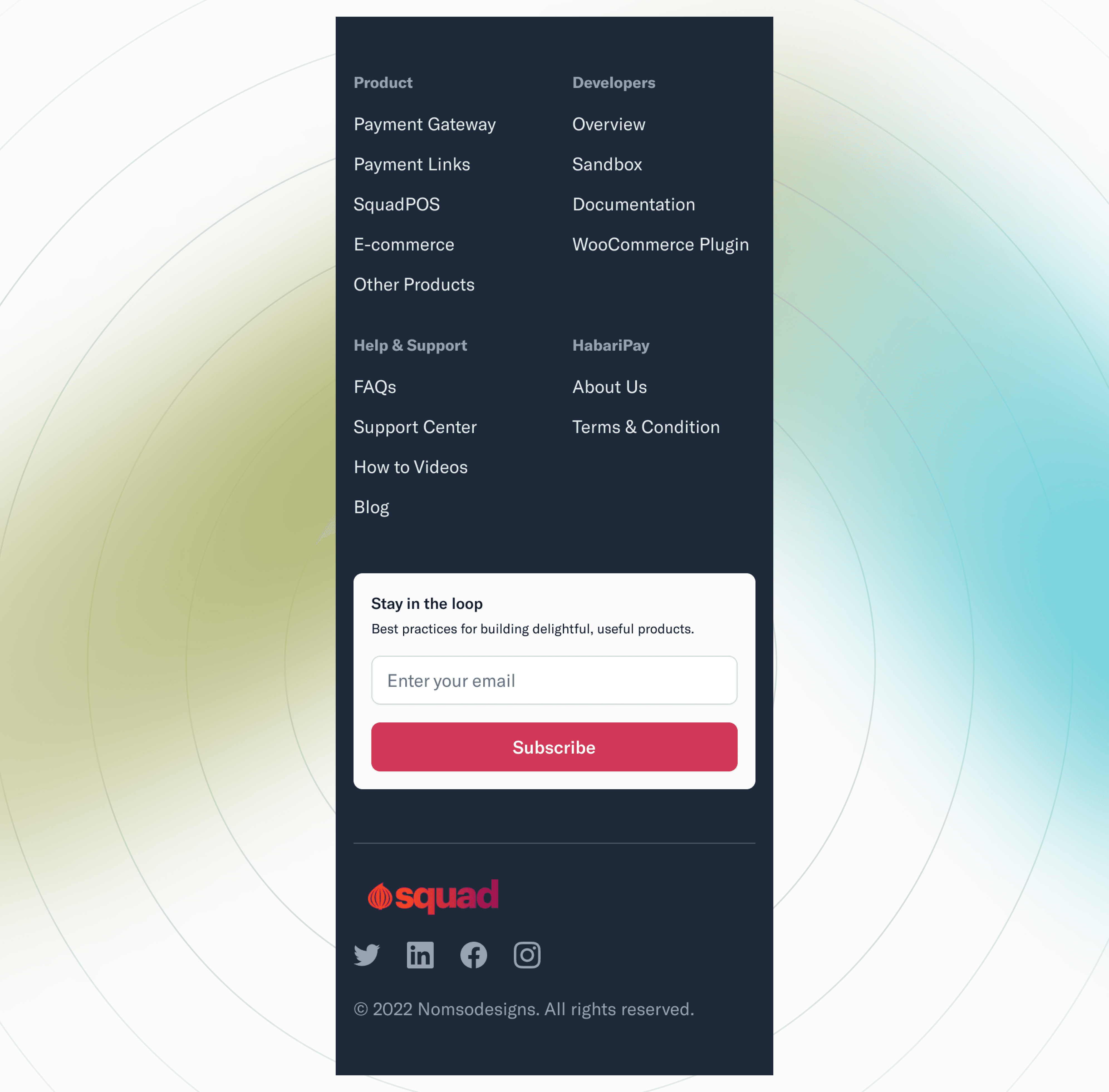
Footer Design
Old Design: Cluttered and unorganized.
New Design:
Fresh, clean, and well-organized layout.
Clear directions and a newsletter option for a professional appearance.
Conclusion
The comprehensive redesign of Squad’s mobile website significantly enhances its visual appeal and usability. These changes will improve user retention and satisfaction, ensuring the website remains competitive.
Contact: For design services including UI/UX design, branding, logos, and front-end development, email Nomsodesigns@gmail.com.
Thank you for reviewing this case study. For further collaboration or design needs, feel free to reach out!