Payoneer Global Inc.: A Brief History
Feb 28, 2022
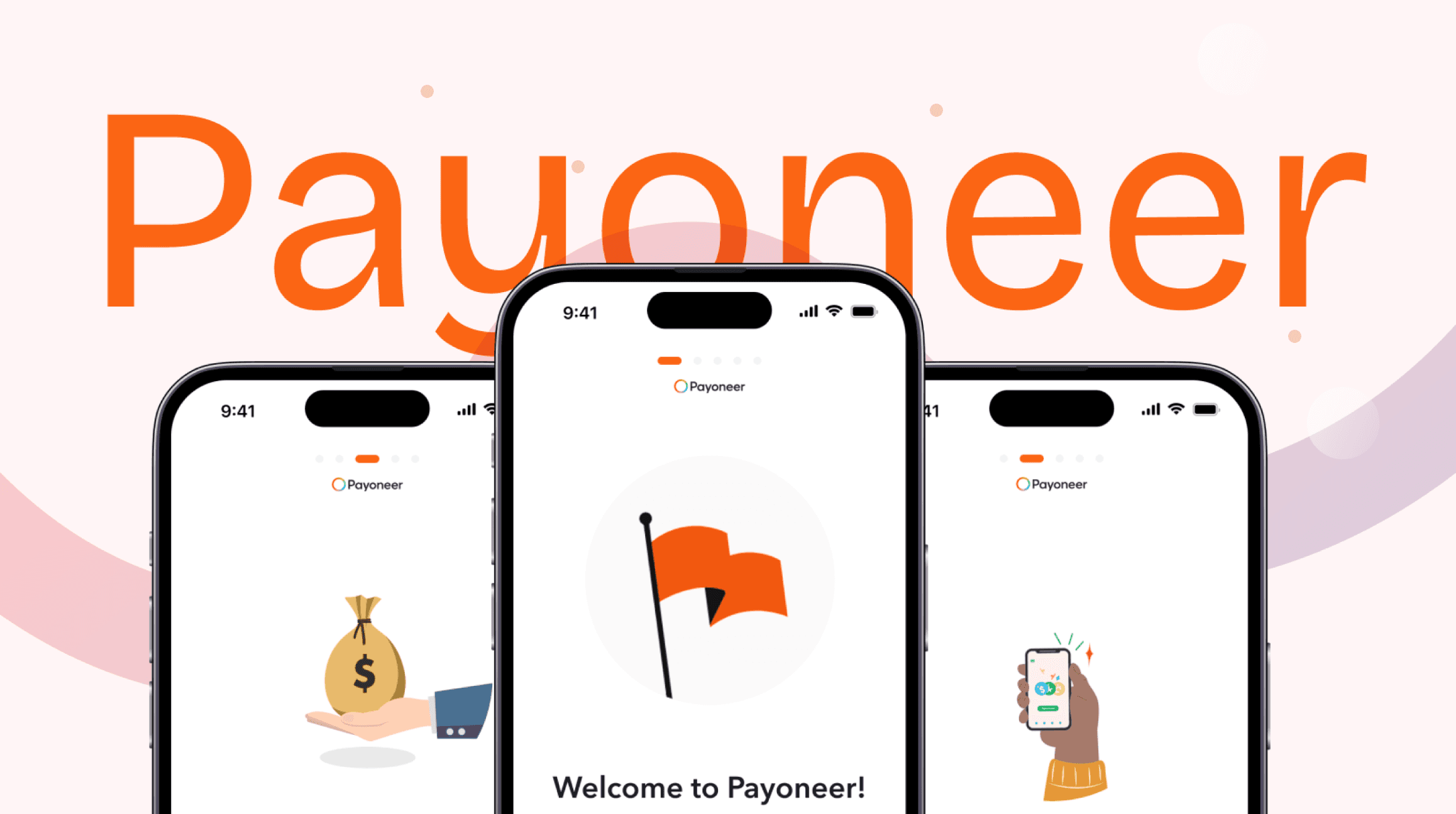
Payoneer Global Inc., an American financial services company, has been a pivotal player in the online money transfer and digital payment services industry since its inception. Established to facilitate secure and efficient international money transfers, Payoneer offers a range of services, including working capital for businesses. Over the years, it has become a trusted platform for freelancers, businesses, and professionals globally, providing solutions to the complexities of cross-border transactions.
My Journey with Payoneer
As my career in product design expanded, I began attracting clients from Europe and beyond. However, receiving payments from these international clients posed a significant challenge. The risks of scams and the potential for money to become inaccessible were major concerns. During my search for a reliable solution, I discovered Payoneer and decided to give it a try.
Initial Impressions and Challenges
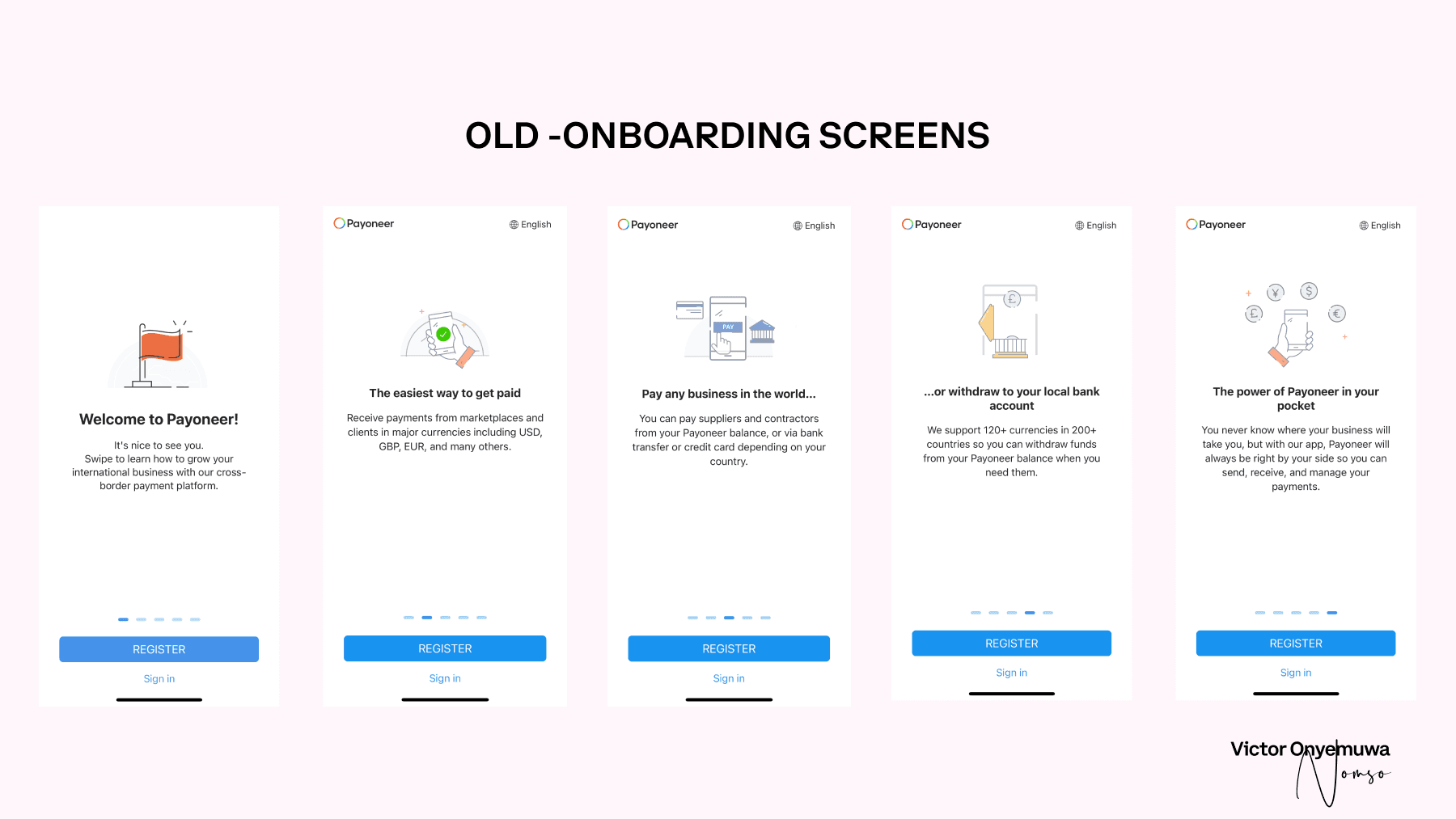
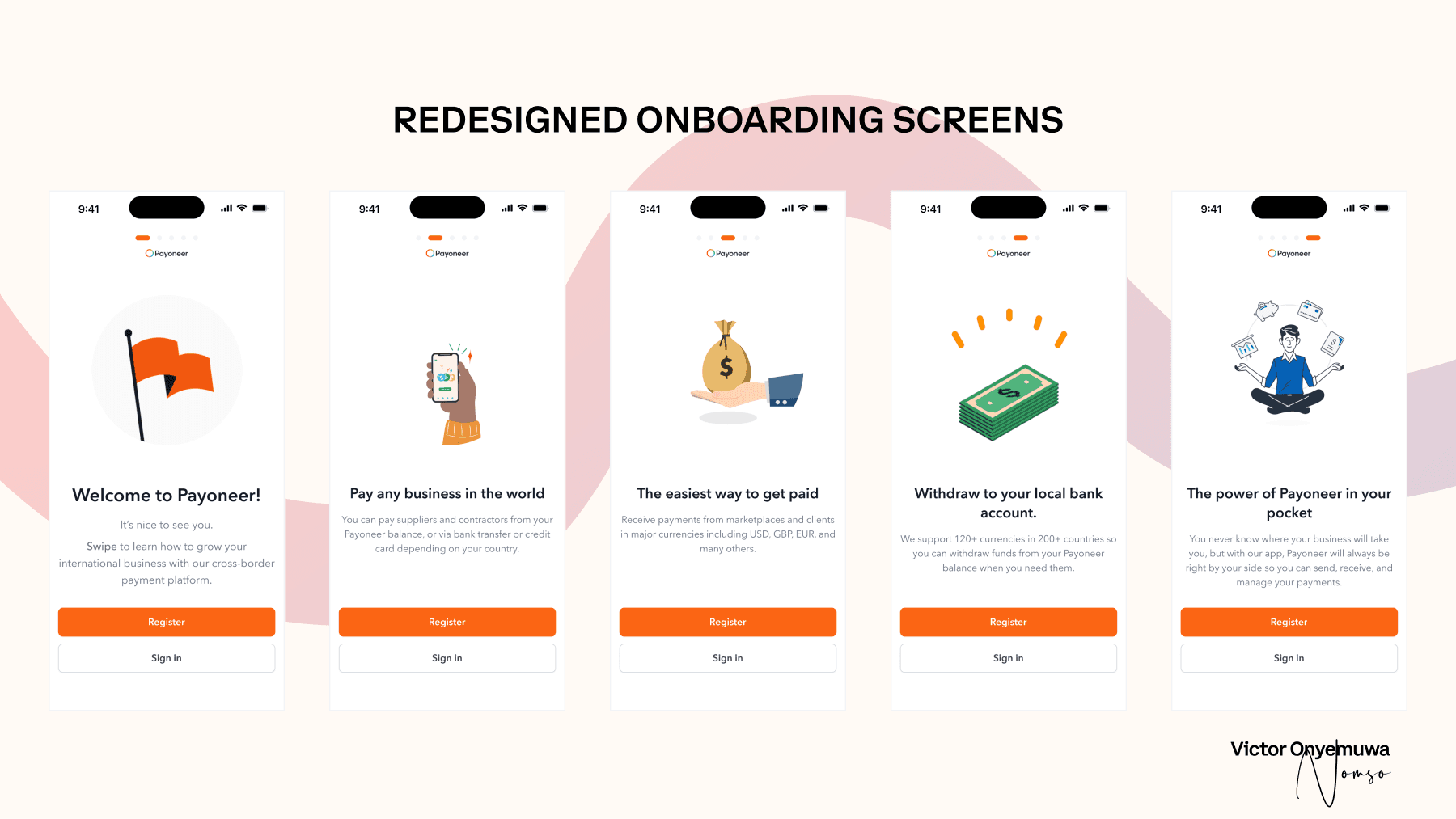
Upon downloading the Payoneer app from the App Store, I was initially greeted by a welcoming onboarding screen that highlighted the benefits of the platform. However, as I navigated through the app, it became evident that the user interface needed a modern touch. The inconsistencies in shapes, buttons, and colors were frustrating and detract from the user experience.
Redesign Efforts
Onboarding Improvements
One of my first changes was to move the pagination to the top of the screen, which improved the navigation experience. I also unified the brand and button colors for consistency and increased the padding around buttons, enhancing their accessibility. Additionally, the distance between the "Sign in" button and the bottom of the screen was increased to prevent accidental clicks.
Pain-Point #1: Redundant Registration Process
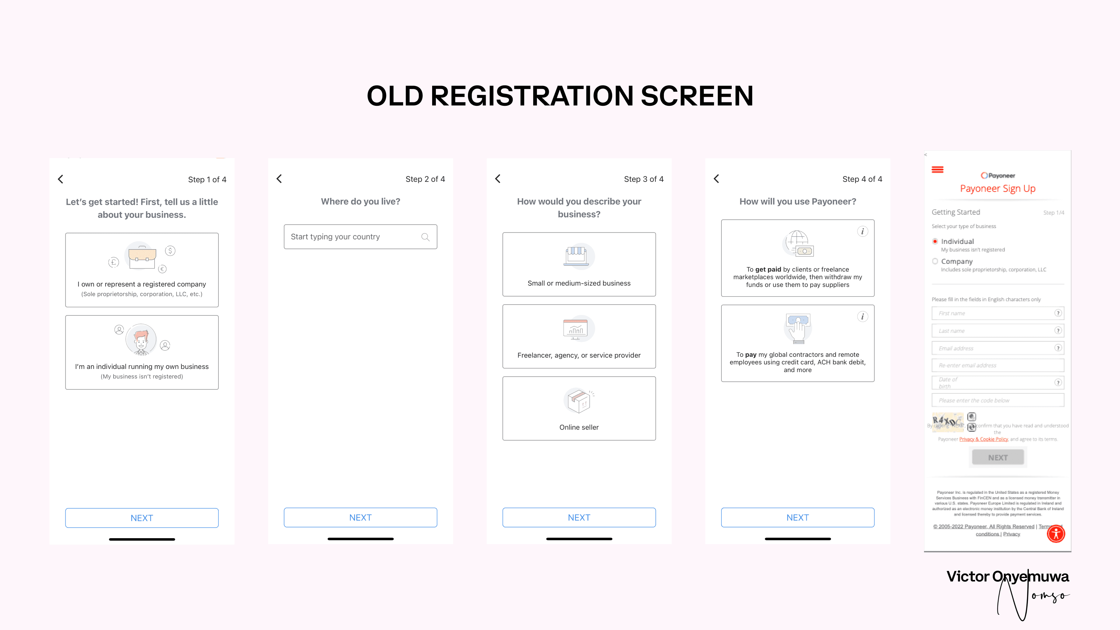
The original registration process included a page asking for the reason for downloading the app, which was redundant when repeated in the sign-up form.
Solution #1: Streamlined Sign-Up Form
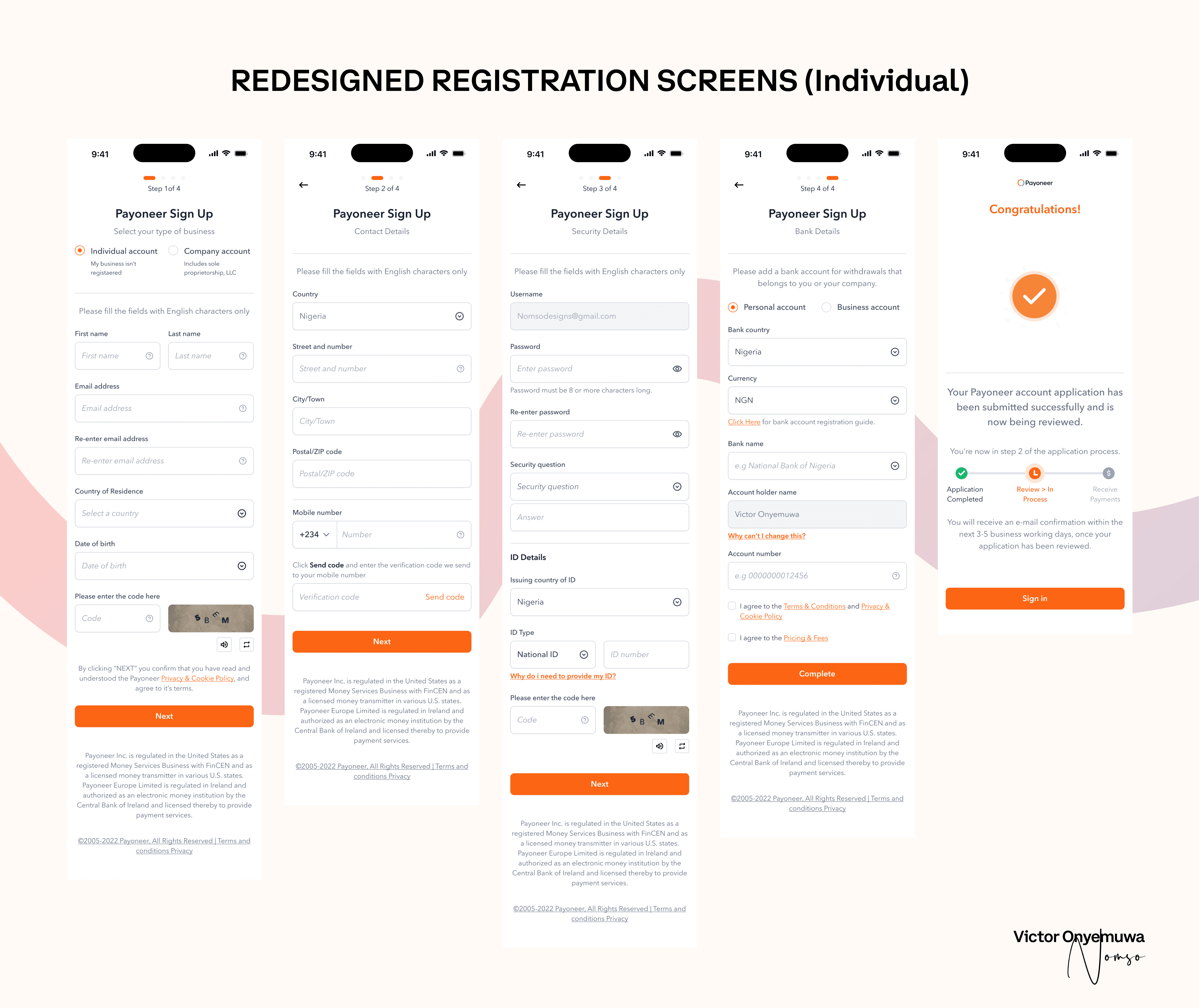
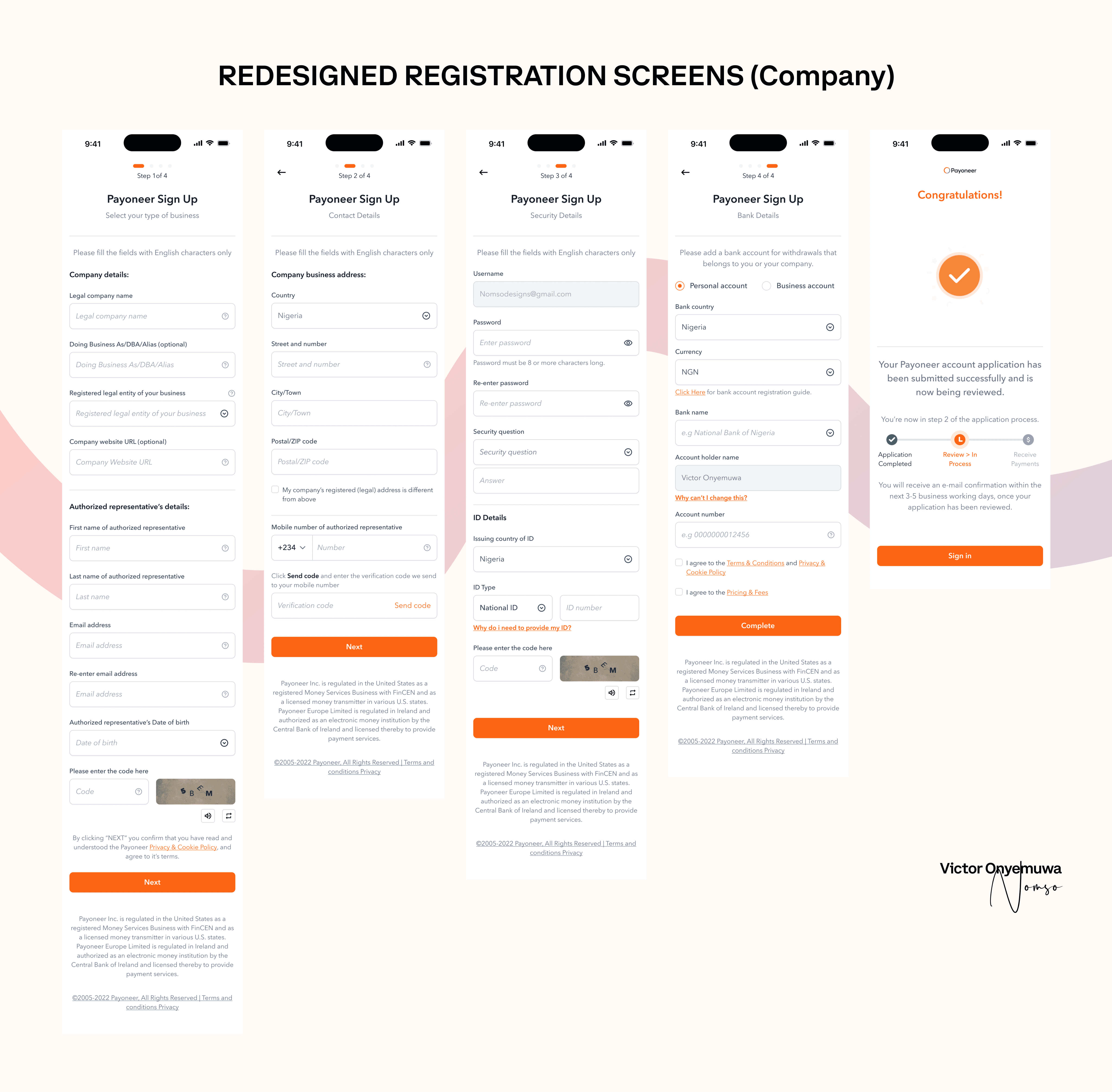
I redesigned the sign-up form to be simpler and more modern. The new form retained essential components but improved overall functionality. It was divided into four pages: Account Type, Contact Details, Security Details, and Bank Details. This structure made it easier to collect vital information such as name, email, country of residence, and date of birth.
Upon completing the form, users were greeted with a congratulatory message and a progress report, indicating their current status in the process.
Pain-Point #2: Outdated Sign-In/Login Page
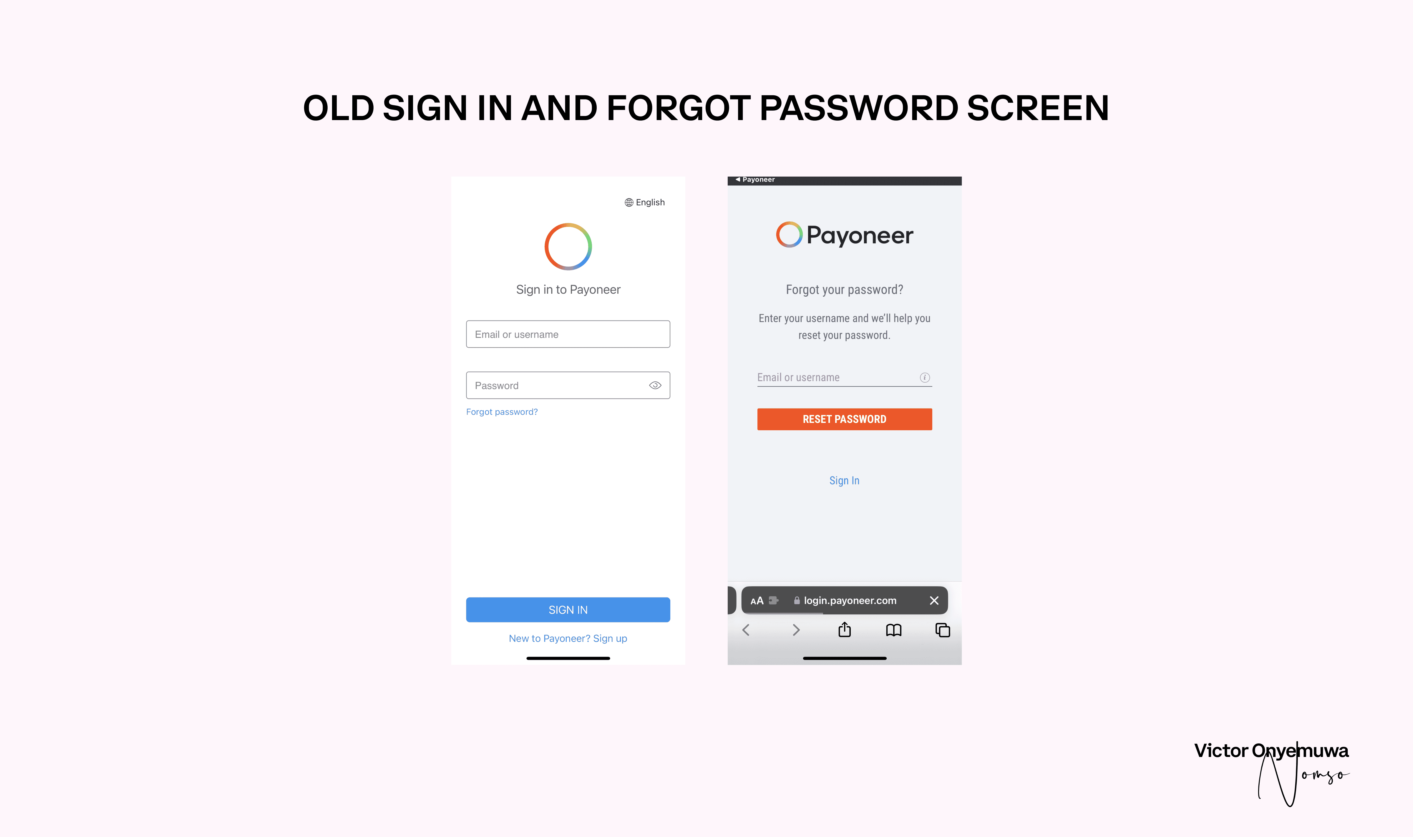
After account creation, users were redirected to an outdated sign-in page.
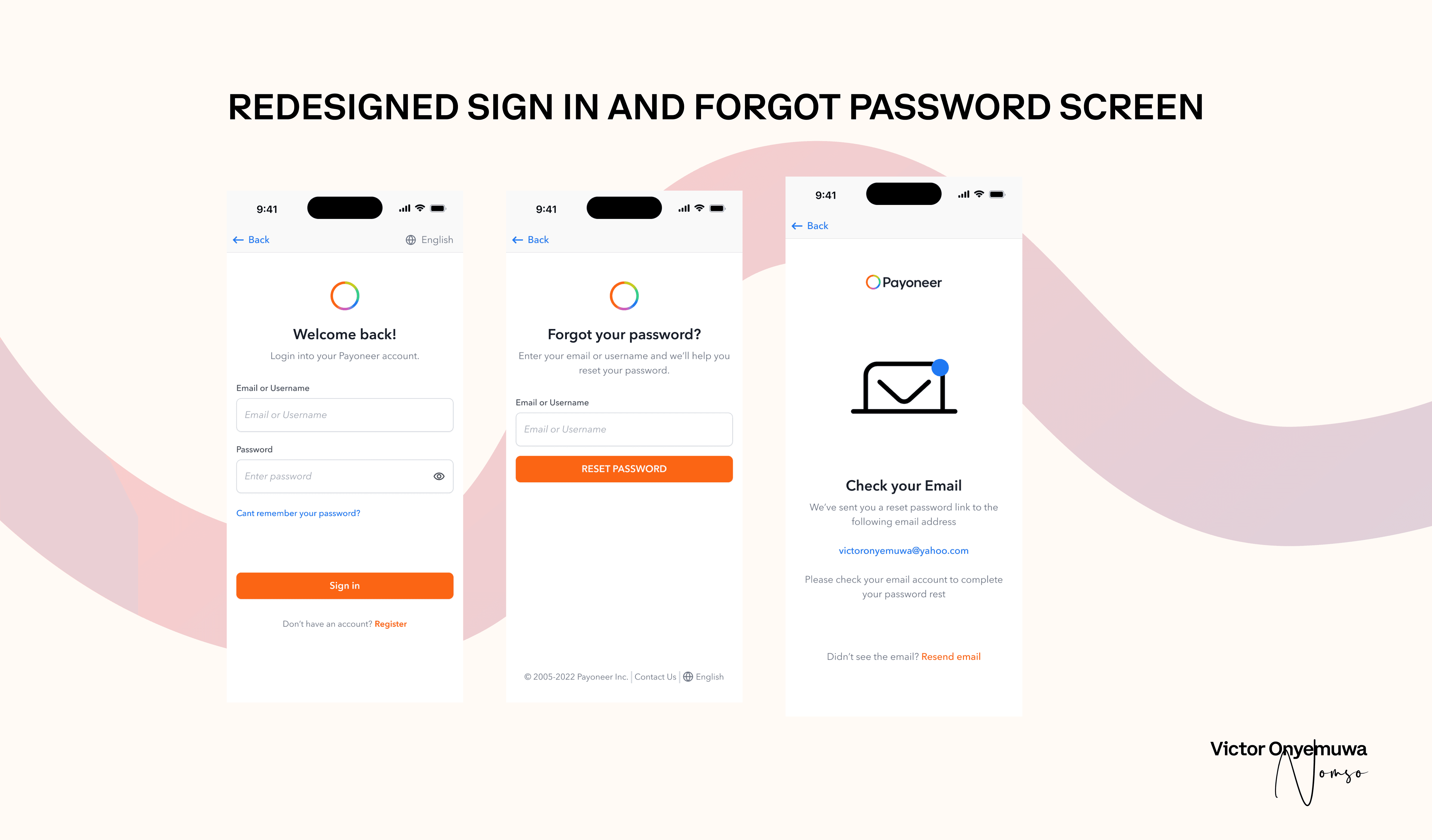
Solution #2: Modern Sign-In Page
I created a contemporary sign-in page with the Payoneer logo centered, accompanied by a salutation and instructions. The sign-in form followed, maintaining color consistency with buttons from the first page. This change addressed the inconsistency where some buttons were blue and others were orange.
Redesign of the Home Page and Other Screens
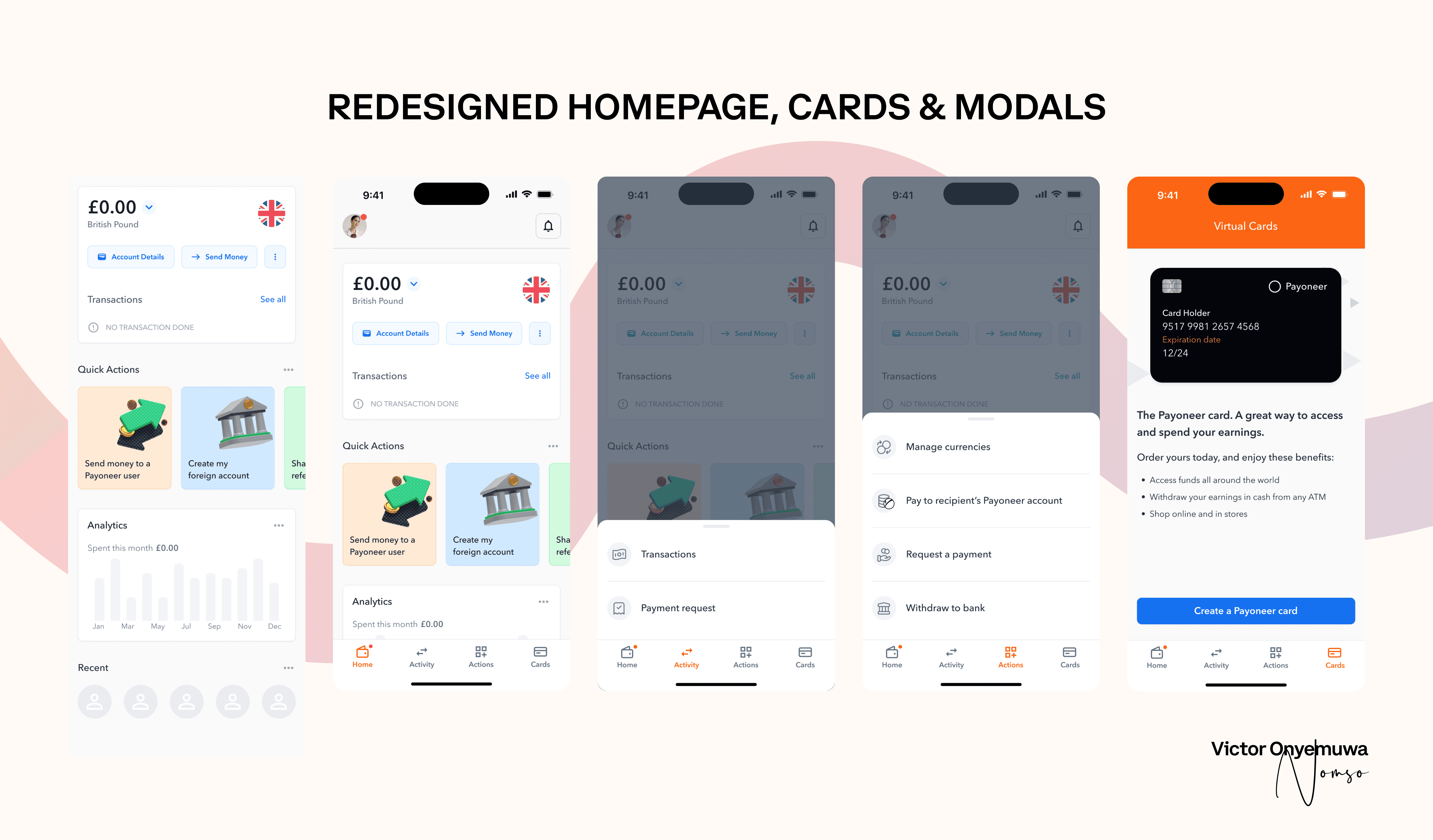
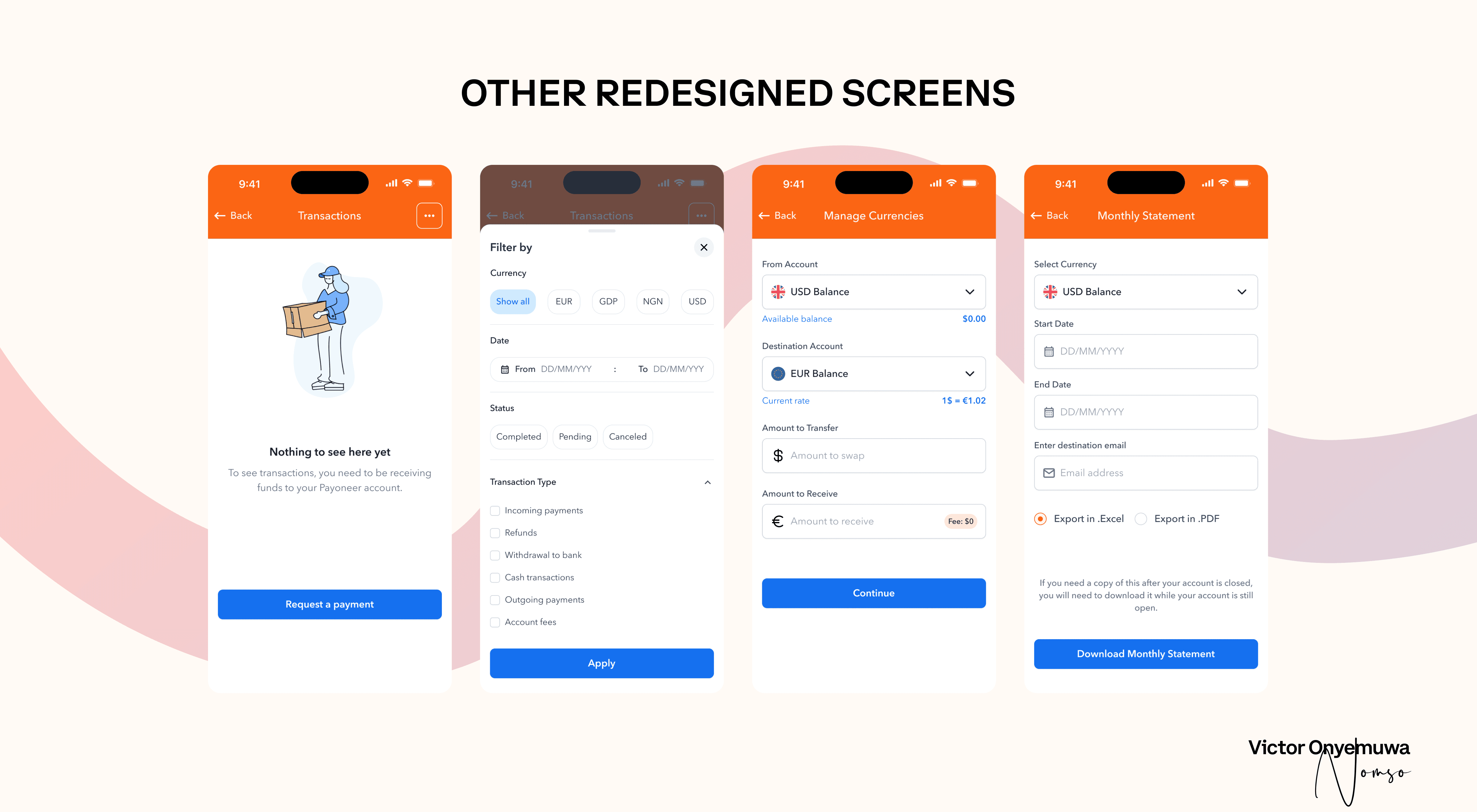
The homepage was revamped to provide users with comprehensive account information. New features included the ability to create foreign accounts, send money, view transaction history, and access detailed account information. Modal designs were retained but enhanced with additional padding for better accessibility.
Conclusion
Thank you for following my journey with Payoneer! If you liked what you saw and read, let's collaborate on your next project. Reach out to me at:
Email: Nomsodesigns@gmail.com
Twitter: NomsoDesigns
Instagram: Vic_nonso
I look forward to working with you!